CSS Grid Layout is a two-dimensional layout system that allows you to create complex grid-based layouts with rows and columns. It provides a powerful and flexible way to design responsive web pages. Here are the key concepts and properties of CSS Grid:
1. Grid Container and Grid Items:
-
Grid Container (
display: grid;): The container element that establishes a grid context..grid-container { display: grid; } -
Grid Items: The direct children of a grid container become grid items.
.grid-item {
  /* Styles for grid items */
}
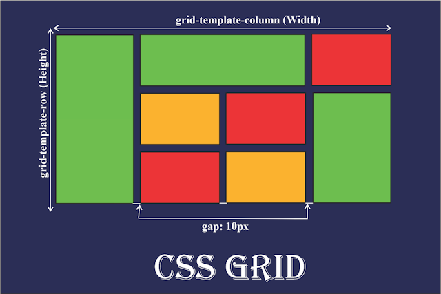
2. Defining the Grid:
-
grid-template-rowsandgrid-template-columns: Defines the size of rows and columns in the grid..grid-container { grid-template-rows: 100px 200px 100px; grid-template-columns: 1fr 2fr 1fr; }
3. Grid Gaps:
-
grid-row-gapandgrid-column-gap(orgrid-gap): Specifies the size of the gap between rows and columns..grid-container { grid-row-gap: 10px; grid-column-gap: 20px; /* or */ grid-gap: 10px 20px; }
4. Grid Areas:
-
grid-template-areas: Defines named grid areas for layout..grid-container { grid-template-areas: "header header" "sidebar content" "footer footer"; }
5. Placing Items in the Grid:
-
grid-rowandgrid-column: Specifies the size and position of grid items..grid-item { grid-row: 2 / 3; /* from row line 2 to row line 3 */ grid-column: 1 / span 2; /* from column line 1 to 2, spanning 2 columns */ }
6. Grid Auto Flow:
-
grid-auto-flow: Defines how auto-placed items are placed in the grid..grid-container { grid-auto-flow: row | column | dense; }
7. Responsive Grids:
-
Media Queries: Combine grid properties with media queries for responsive layouts.
@media (max-width: 600px) {
  .grid-container {
    grid-template-columns: 1fr;
  }
}
8. Alignment:
-
justify-itemsandalign-items: Align grid items within the grid..grid-container { justify-items: center; /* Align items horizontally */ align-items: center; /* Align items vertically */ }
9. Justify and Align Content:
-
justify-contentandalign-content: Align and distribute content within the grid container..grid-container { justify-content: space-around; /* Distribute columns with equal space around them */ align-content: space-between; /* Distribute rows with space between them */ }
10. Grid Lines:
-
grid-template-columnsandgrid-template-rowscan use line names: Assign names to grid lines for reference..grid-container { grid-template-columns: [start] 1fr [main] 2fr [end]; }
CSS Grid Layout is a powerful tool for creating sophisticated and responsive layouts. Experimenting with different combinations of properties and values will help you become proficient in using CSS Grid for a wide range of design scenarios.